Fun With Variable Fonts
Variable fonts are super neat and today abundant enough that you _should_ be considering them for new projects. While checking out Github's microsite for Mona Sans, I noticed a bunch of simple but playful animations they being used to highlight some of the capabilities of variable fonts.
Variable fonts are super neat and today abundant enough that you should be considering them for new projects. While checking out Github’s microsite for Mona Sans , I noticed a bunch of simple but playful animations they being used to highlight some of the capabilities of variable fonts.
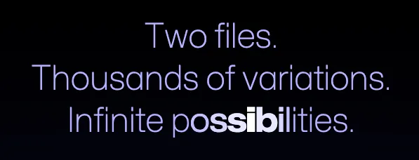
What we’re recreating.
While the lowercase “i” in possibilities is being hovered in the example above, we can see
that font-weight of siblings gradually decreases until reaching whatever the default is.
I am trying to move away from habitually reaching for JavaScript to create things like this,
and instead use a more fitting tool: CSS.
From the above observations we can conclude that each character needs to have its own <span>
tag. Let’s start with that.
<div class="github-effect">
<span>I</span><span>n</span><span>f</span><span>i</span><span>n</span
><span>i</span><span>t</span><span>e</span><span> </span><span>p</span
><span>o</span><span>s</span><span>s</span><span>i</span><span>b</span
><span>i</span><span>l</span><span>i</span><span>t</span><span>i</span
><span>e</span><span>s</span>
</div>I’ll use 200 as my default font-weight. With the functional pseudo class :has() and the
adjacent sibling selector + one can set the font-weight of preceding and following
characters on :hover.
.github-effect {
  font-weight: 200;
  letter-spacing: -0.025em;
}

.github-effect > span {
  transition: font-weight 200ms linear;
}

.github-effect > span:has(+ span + span + span:hover) {
  font-weight: 400;
}

.github-effect > span:has(+ span + span:hover) {
  font-weight: 500;
}

.github-effect > span:has(+ span:hover) {
  font-weight: 700;
}

.github-effect > span:hover {
  font-weight: 900;
}

.github-effect > span:hover + span {
  font-weight: 700;
}

.github-effect > span:hover + span + span {
  font-weight: 500;
}

.github-effect > span:hover + span + span + span {
  font-weight: 400;
}
A tighter kerning (negative letter-spacing) and a linear transition makes the
animation look better to me! Unlike the typeface Manrope that I am using,
Github’s Mona Sans also supports stretching. Something that really adds to the effect.
There is a bunch of stuff we could add to this effect. For an example, below I have added some default blur and lower opacity.
Or something like a funky gradient effect by offsetting hsl() values.
It ain’t pretty, but you get the picture!
Happy coding!